

One of the most important things in UI Design is a shadow. A shadow helps create dynamic views and displays that enhance the user experience.
We use shadows usually to:
Distinguish between two objects on same colour on top of each other
Create a neumorphic effect
So, let us take a few examples.
Draw a Rectangle from the following code:
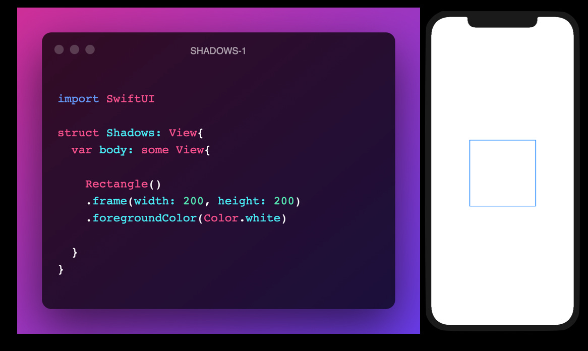
Now, as we can see, a white rectangle over a white surface is invisible. So, how do we make it visible but keep the foreground colour the same? The answer is a shadow.
So we can now add the .shadow() modifier to our rectangle. The code goes as follows:
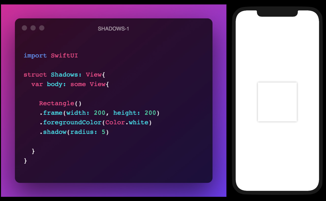
This seems good. Now the rectangle is visible. But what a designer would say at this point would be “What if I could customise my shadow?“. Thanks to SwiftUI, you can.
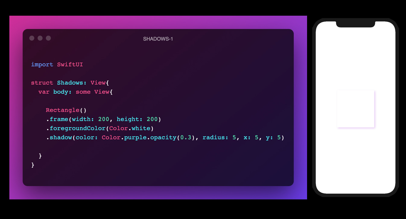
One way of doing this is use a complete shadow modifier
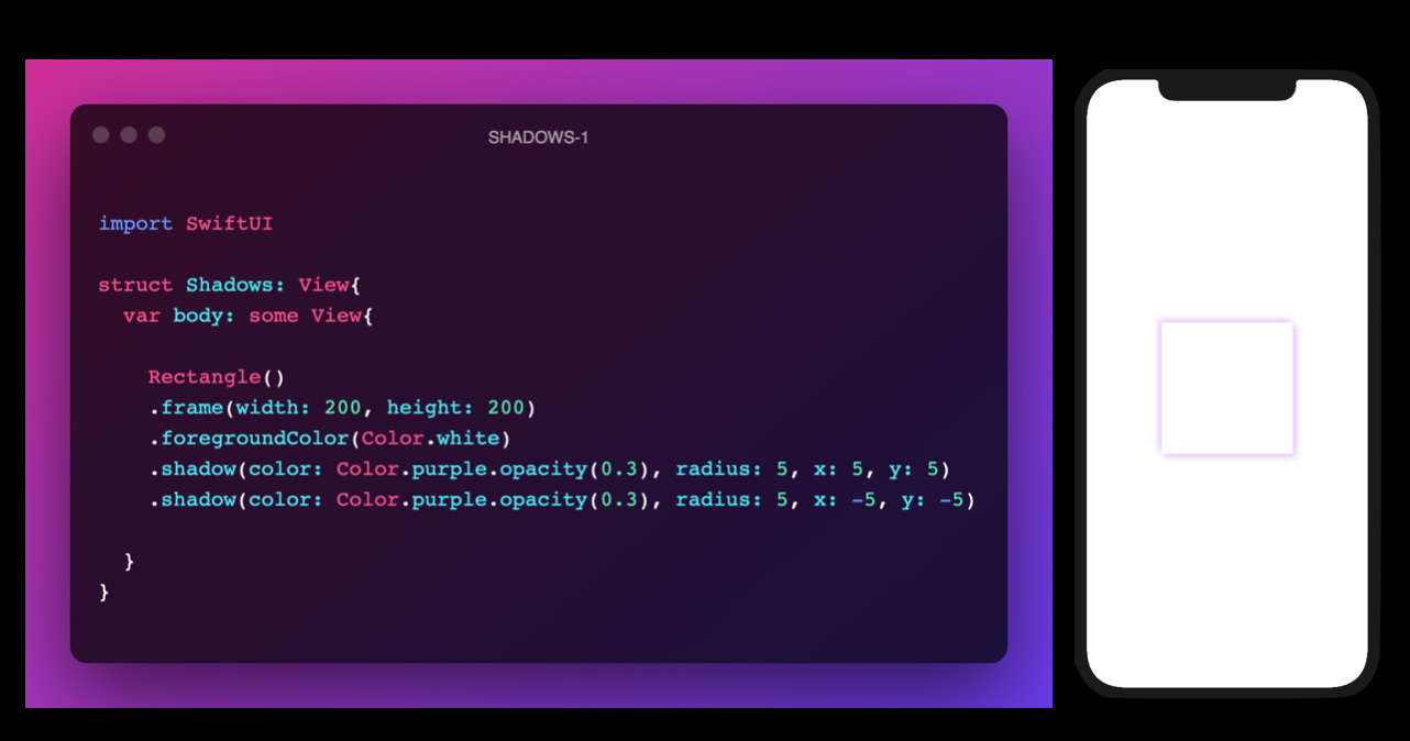
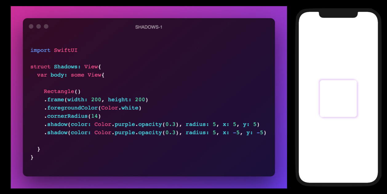
.shadow(color:radius:x:y)The code follows as shown:
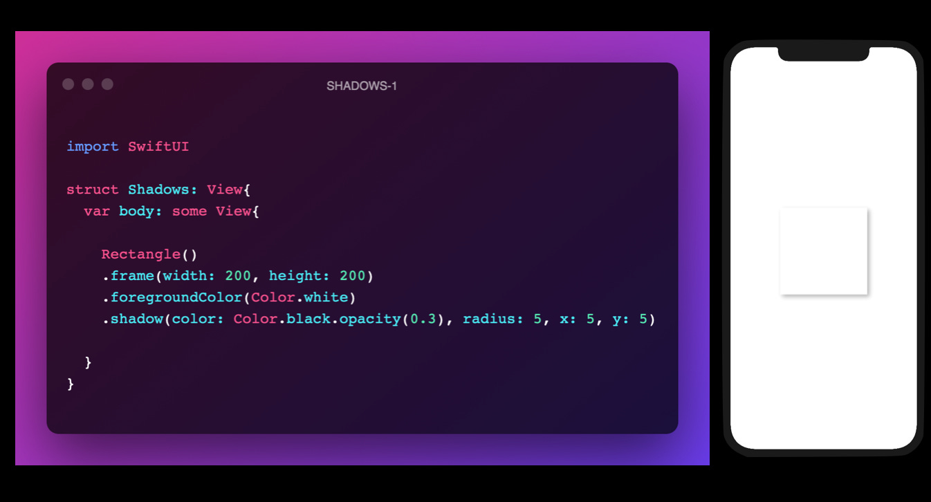
Now the shadow looks pretty good. Try experimenting with the colours and opacities. See what you can make of it.
Another thing which we can do is add 2 shadows. It gives really nice effect. If you are using different colours then it creates a sort of “glowing“ effect around the rectangle.
To increase the beauty of the view, we usually apply a corner radius to the shapes with pointy ends. Add a corner radius. An ideal value would be 14 but any value would be deemed ideal if it matches your design.
I really hope that this article of much use to you. Please comment down below any suggestions.